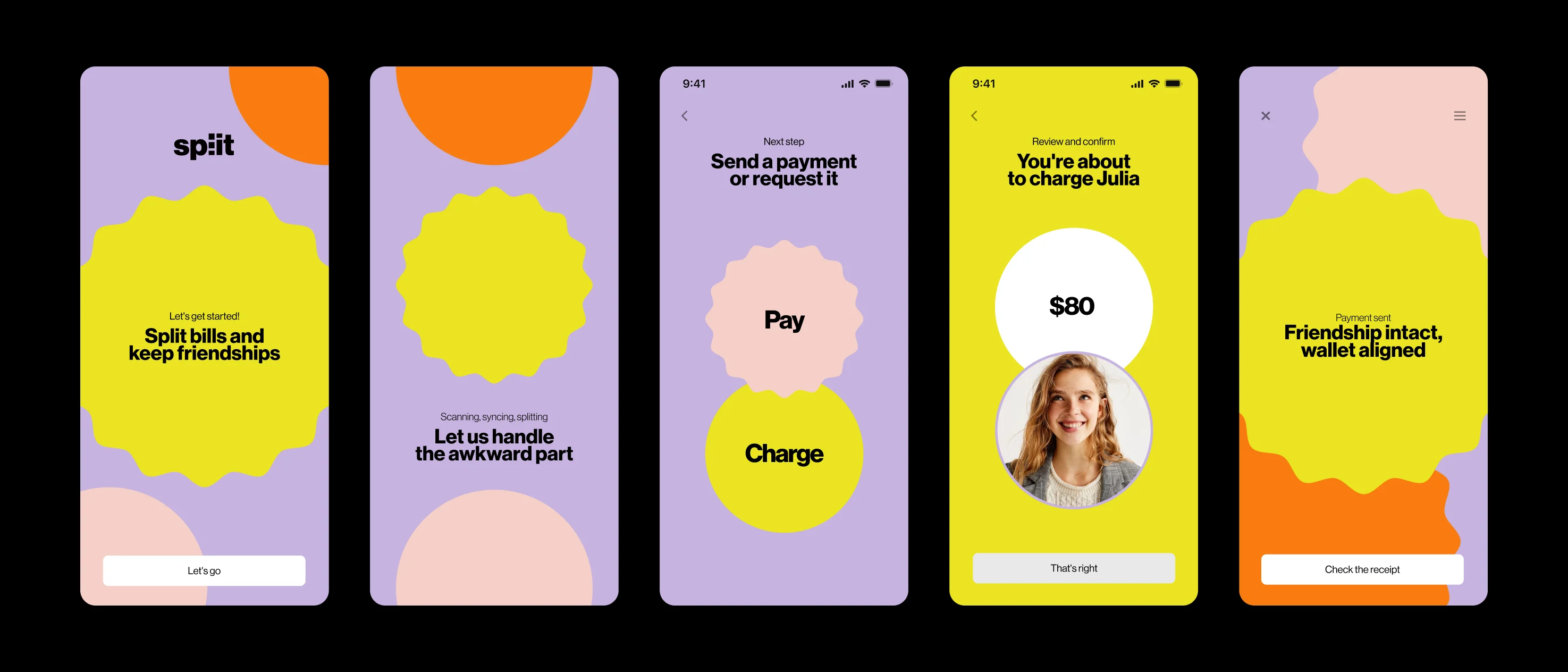
Split
One iteration turned three screens of assignment into one.
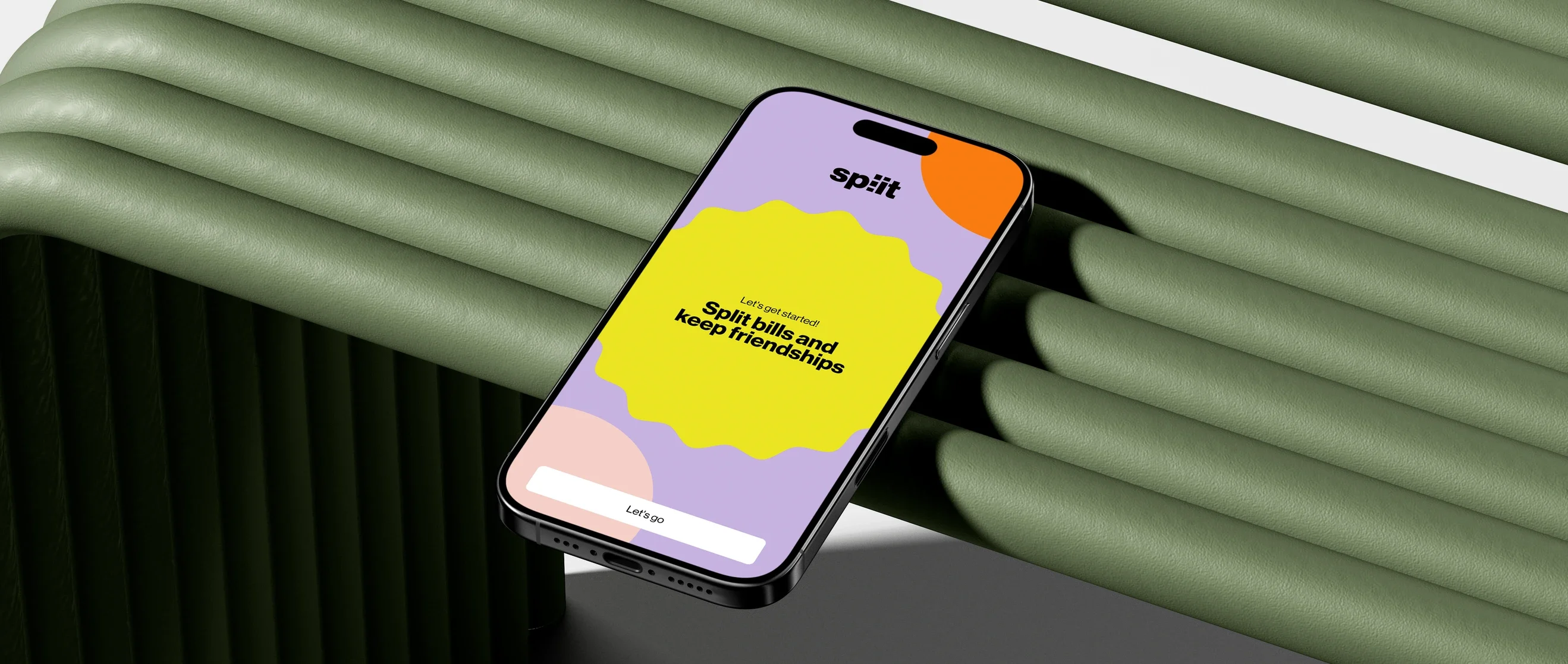
Splitting the bill,without the awkwardness
Context
The idea started as a case study presented in class: an app for splitting bills.
After the course ended, my teammate and I brought it back to life to develop our own version, not because the idea was already fully formed, but because we saw a clear gap in the existing solutions:
they didn’t let people split a bill in real time, right when it arrived at the table.
The goal was clear from the beginning:
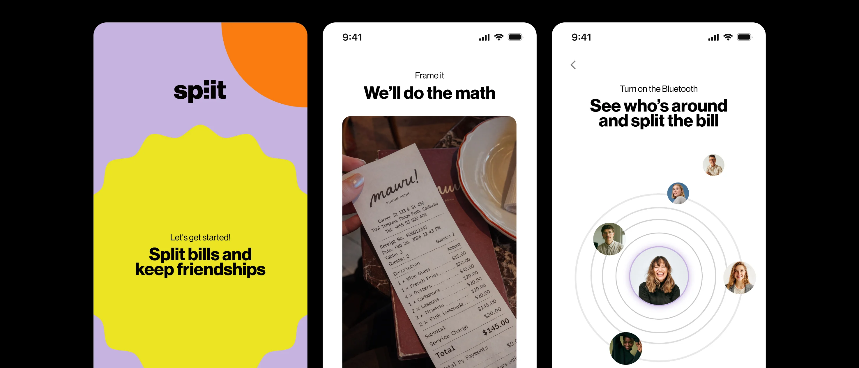
- Photograph the receipt
- Split the bill
- Pay
The challenge was never figuring out where we wanted to get. It was figuring out how to move between those three points without overwhelming the user along the way.
Benchmark
We looked at what already existed, Splitwise, Settle Up, and Splid.
All three handle ongoing balance management between people well: who owes what, shared expense history, and recurring payments.
But they all start from the same place:
manually entering amounts after the bill has already been closed and the social moment has passed.
None of them were designed for the moment when the bill actually arrives at the table and everyone wants to settle it right there, without opening a spreadsheet later.
That was the space we saw for Split.
Iteration
Our first version of the flow looked logical on paper, but felt heavy in practice.
Users had to manually split the items they had ordered and then assign who had participated in each one, across separate screens, with a lot of text and very little visual guidance.
We tested it, synthesized the information, and iterated.
But even after the second round, the assignment stage still required three screens of effort.
The flow worked, but it asked too much from the user at exactly the moment when they simply wanted to settle the bill quickly.
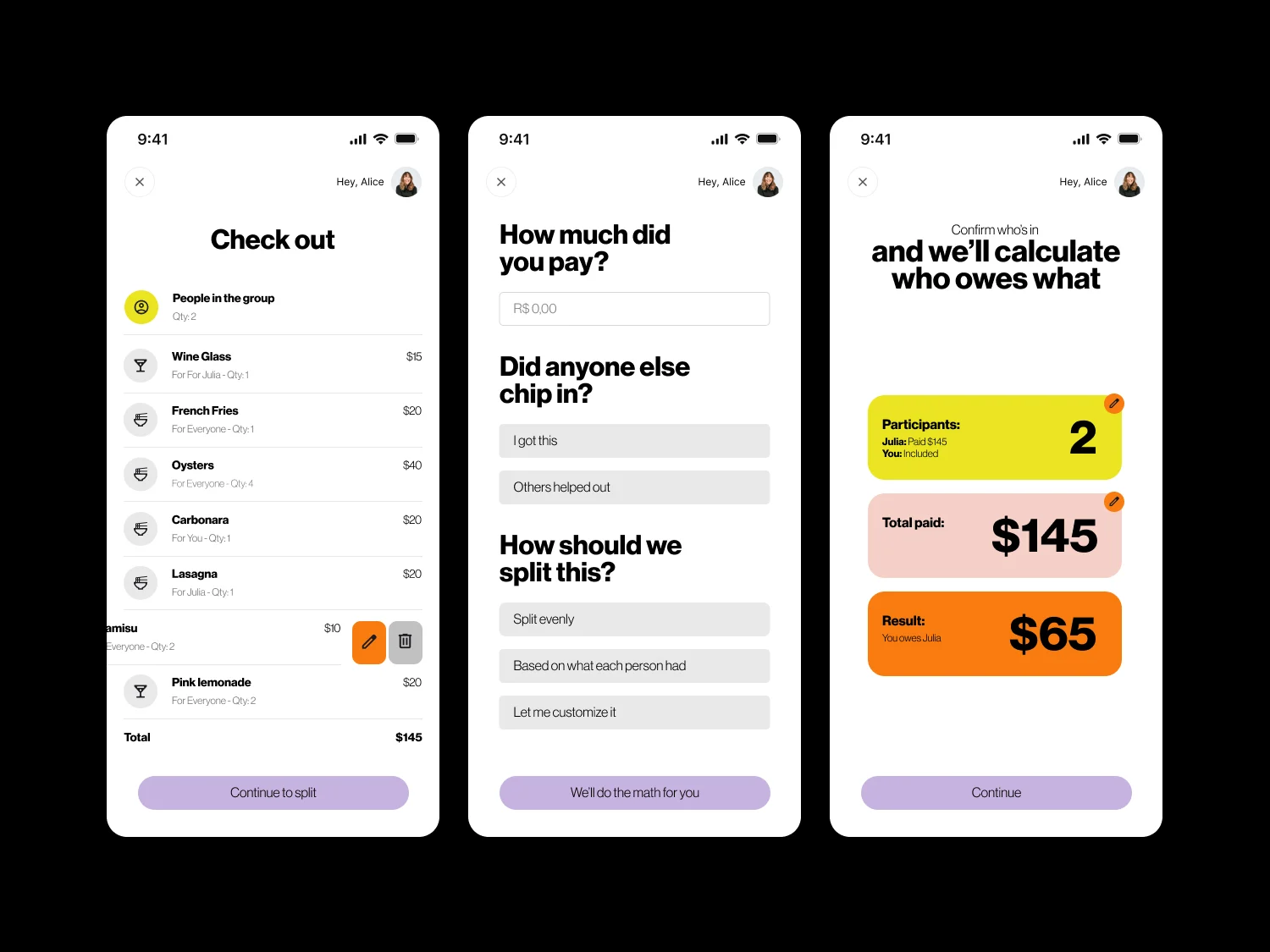
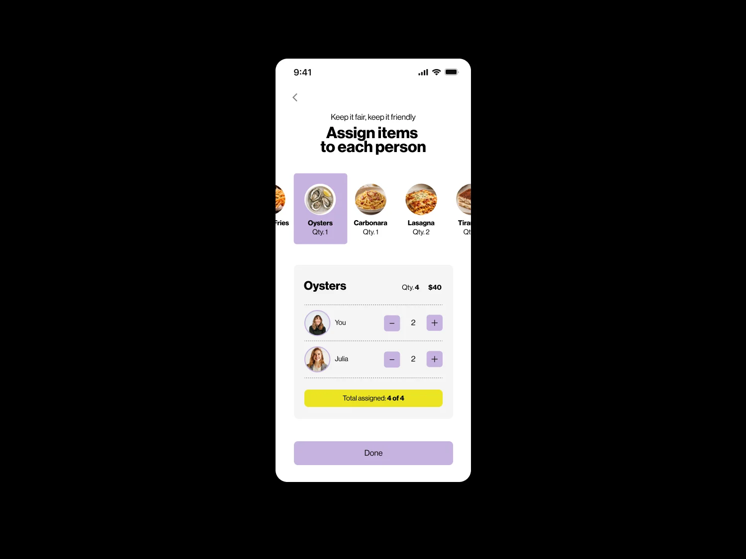
The breakthrough came from two small decisions that, together, solved the biggest bottleneck:
Change the order.
Instead of splitting items first and deciding who participated afterwards, the user selects the people at the table first. This eliminates an entire question later in the flow.
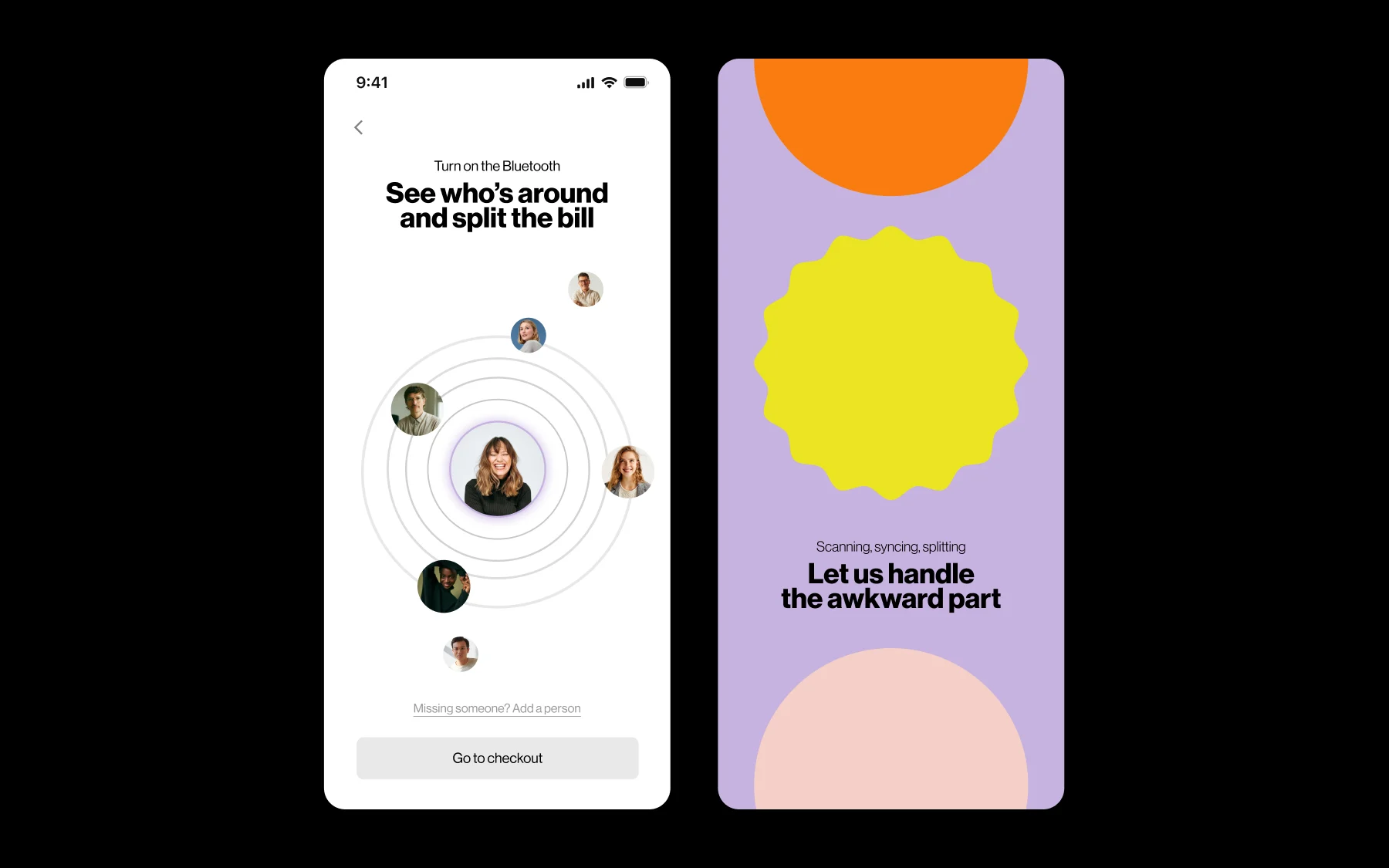
Replace the list with visual interaction.
Each item became a tappable card with an AI-generated image of the actual dish, created during receipt scanning. Instead of reading “1× Oysters, 1× Carbonara, 2× Lasagna,” users recognize each dish and assign it with a tap. The flow then moves to the next item.
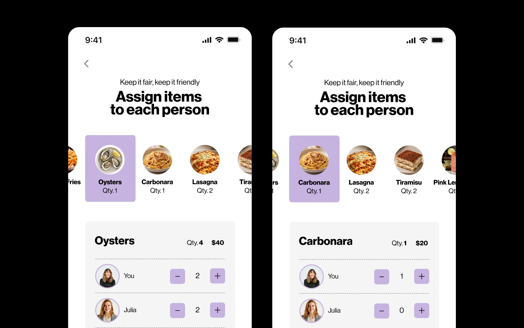
These two changes reduced the assignment stage from three screens to one.
That was the point where the entire flow clicked into place.
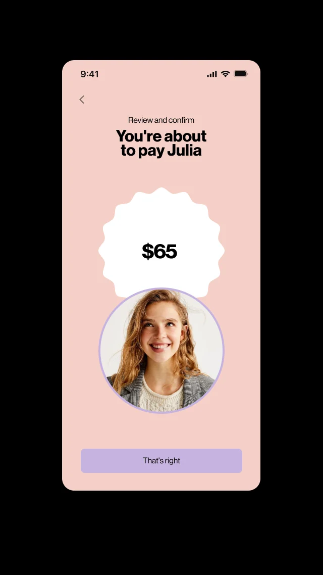
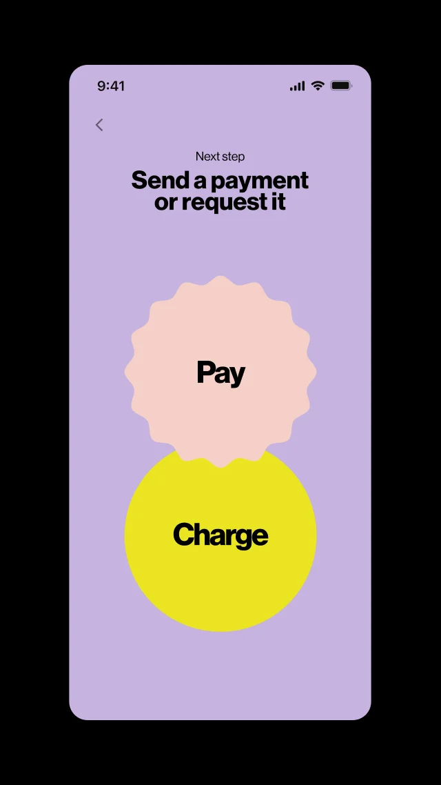
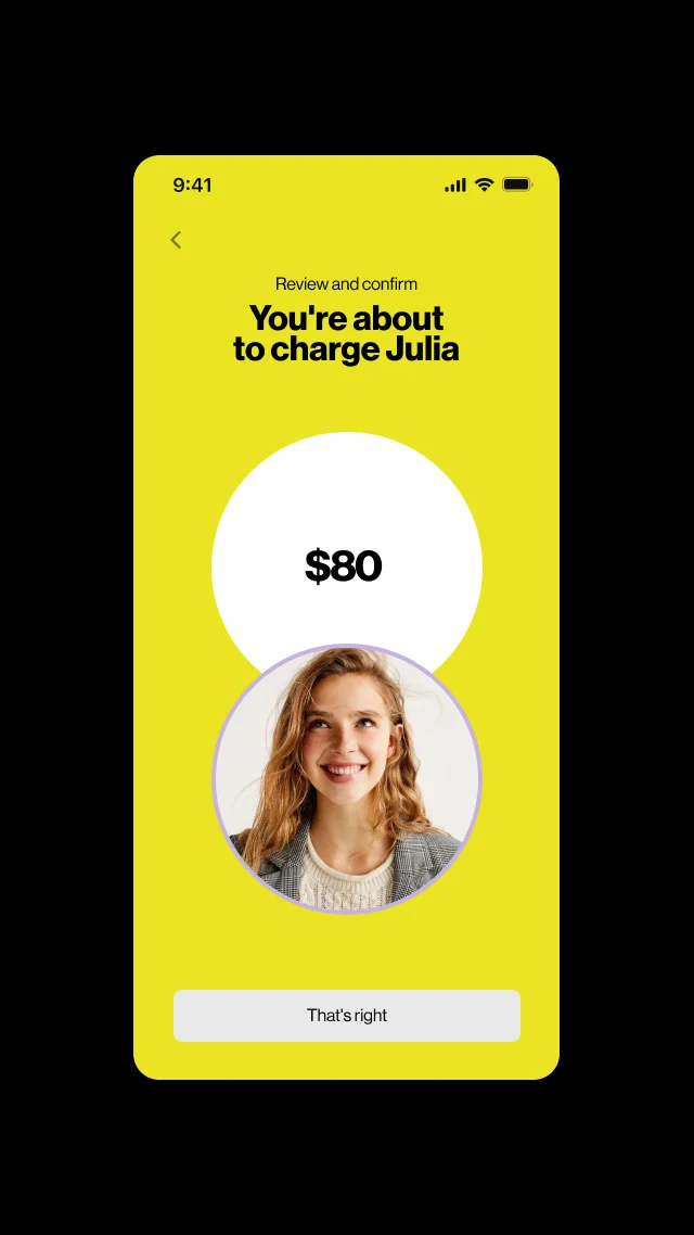
Checkout, the choice between paying or requesting payment, and the integrated Apple Cash payment could now follow as a natural sequence, rather than feeling like another heavy step after an already demanding process.
My approach
UX: The assignment funnel
I was responsible for designing the complete flow:
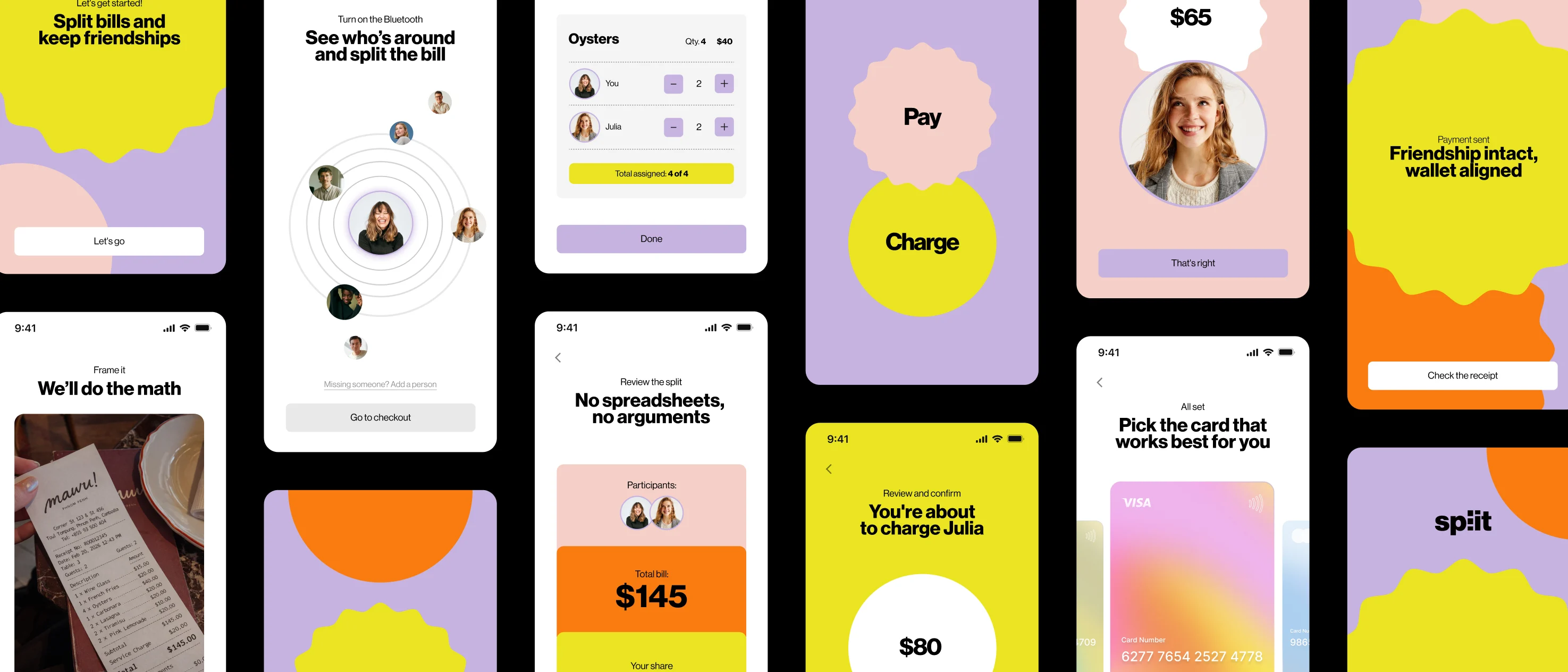
- Participant identification
- Loading
- Bill splitting
- Checkout
- The choice between paying or requesting payment
- Payment
- Completion
The most critical part of my work was simplifying the exact point where users were getting stuck:
turning item assignment into one action per item (tap who consumed it), with nothing else competing on the screen and nothing to reread.
Design system & visual tone
Money between friends can still be an uncomfortable subject, and our research reinforced that with some striking numbers.
21%
of people had lost a friendship because of money
26%
said they had felt financially incompatible with their friends
Source: The Guardian, “How to split the bill without causing long-term divisions” (opens in a new tab) (21 April 2025), which cites a 2024 study by Bread Financial.
That insight made me treat the visual tone as part of the solution, not just a finishing layer.
I defined a deliberately joyful visual language:
- Bright colors
- Large rounded shapes
- A light visual hierarchy
The idea was for the design to do some of the emotional work that money itself can’t do, making splitting a bill feel practical and effortless rather than like another potential source of tension between friends.
This approach also shaped the microcopy throughout the experience:
“Keep it fair, keep it friendly.”
“No spreadsheets, no arguments.”
Every screen reinforces the idea that splitting a bill can be quick, simple, and free of awkwardness.
I prototyped the entire app, from the initial flow validated through testing to the final version.
Result
Split evolved from a three-screen, effort-heavy assignment flow into one action per item (who consumed it, and nothing else on the screen), with checkout, action selection, and payment integrated into a single, seamless sequence.
The documented iteration, from the initial text-based flow to the final visual and sequential experience, was what transformed a classroom case study into a product designed around a specific gap in the market:
splitting the bill right there, at the table, without spreadsheets and without awkwardness.